Microcopy: tiny words with a huge UX impact
When we think about designing a great user experience, it’s easy to get caught up with all the things. The fonts, the colours, the flows, the content. Everything. But there’s another component to UX that can instantly delight your users that you might be overlooking. I’m talking about microcopy.
What is microcopy?
Microcopy is the term for the small bits of copy on an app’s interface that help users ‘do stuff’. Microcopy examples are error messages, contact form explainers, ecommerce hints. At a glance, these tiny clusters of words seem insignificant when compared to the overall app design. But surprisingly, those tiny words have a huge impact on conversions.
Author/Copyright holder: visualpun.ch. Copyright terms/licence: CC BY-SA 2.0
Why microcopy matters
But just because microcopy is small, doesn’t mean it’s easy to implement. There are multiple factors that play a role in designing great microcopy. Here are a few tips to make a little bit of text pay off in a big way.
Revisit it when things aren’t working
Usability testing gives you insights into what parts of the copy are clear, and what confuses the user. Small tweaks can make a huge difference. Analyse the microcopy when things aren’t working.
When Veeam noticed through their on page survey, that many visitors were asking for a price:
Veam Product Page (before)
They tested changing the phrase from “Request a quote” to “Request pricing” and saw a 161.66% increase in clicks to their lead gen form.
Veam Product Page (after)
Takeaways:
Encourage users to think out loud as they complete tasks and you’ll learn a lot about your copy from what they say.
Revise your copy based on insights gained in A/B Testing.
Alleviate the user’s worries
Your microcopy can also objection-handle any doubts a user has about registering, subscribing or buying. You should anticipate user’s questions. User testing is a great way to find out what kind of questions users are asking.
Fear of Spam: Whilst ‘not to auto-tweet’ might be taken for granted by good marketers when asking for twitter connections, the user is less than sure. Microcopy from Timely covers all the potential user concerns in one tight little sentence.
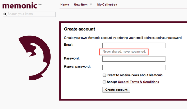
Memonic, a note-taking app, puts the registrant at ease by being pretty bold with its email address field. It’s great to reassure users, as long as you back it up with action:
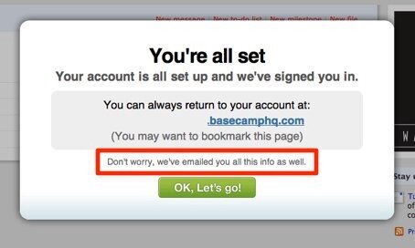
Data loss: You don’t need to worry about your account data if you use Basecamp sign up:
Why Do You Need That?! Facebook addresses all user’s concerns, head-on, in its signup box. Their form explains the service is free (forever), and if you’re nervous about giving your date of birth it deals with that too. The purpose of using clear labels and explanations in forms and their fields is to neutralise any potential input problems.
Facebook Sign Up
Takeaways:
Button labels should be the action the user will take by clicking on it.
Microcopy should address all user’s concerns.
Use helpful error messages
When something goes wrong, it’s helpful to know exactly what happened. But if you aren’t explicit about the error, your users are going to have a hard time figuring out how to fix it.
Mailchimp handles the error state
Takeaways:
Always tell the user what’s wrong and how to fix it. Instead ‘Your form contains errors. Please rectify and resubmit‘ use ‘Seems that entered credit card number is too short’
Talk to your user like a person. Have a conversation and convey technical information in simple terms.
Keep it short and helpful
Think about the actions and results you’re looking for. When implementing microcopy use simple unambiguous language and short snappy sentences. Users don’t want to read long instructions on how to complete a single task. It’s supposed to be microcopy, not a long paragraph of content.
Personalisation in design
Takeaways:
Be sure to write labels for people. Labels should be in plain language and not technical jargon.
Button labels should be the action the user will take by clicking on it.
Pick your moment
There’s nothing wrong with reminding your customers or subscribers they are about to do a very smart thing. So feel free to add a little boast like Basecamp does. It does no harm to a sign-up page to give the impression of recency by pulling in numbers like this.
Basecamp Sign Up
But you should find the right balance. If you show unnecessary information all at once, you will clutter your UI and strain your users’ cognitive load with unnecessary information.
Takeaway:
Show microcopy only when the user enters a state where it becomes necessary.
Microcopy isn’t everything
Microcopy can’t fix every usability issue. It simply can’t guide the user through a bad UX. If there’s a problem with the design, then fix the design.
If you can’t explain it simply, you didn’t design it well enough.
Bill Beard said: “The best experiences have minimal copy because they’re intuitive.”
Conclusion
Well-written microcopy guides users, and poorly written microcopy confuses and frustrates them. So, the next time you’re creating or improving an experience, I hope you employ some of the tactics provided here.
🔍 Related: What is UX writing?
=====


