
How to craft a customer case study page that converts
Customer case studies are among the most powerful tools in a B2B marketer’s arsenal. And when this kind of content is pulled together and conveyed in the right way, it doesn't just showcase success stories; it builds trust, shortens sales cycles, and drives conversions.
But guess what… There are still way too many businesses treating case studies as static PDFs buried in their ‘resources’, ‘case studies’, or ‘insights’ section. They’re not being wielded like the dynamic conversion tools they truly are.
The truth is, if you want your case study pages to actually convert, you need to go beyond storytelling and treat each one like a landing page.
Here’s how to craft a customer case study page that does the heavy lifting for your sales and marketing teams. Plus, I’ve included some examples from B2B brands that are nailing this content type.
1. Start with a strong, scannable structure
If we’re to believe the old assumptions, B2B buyers are constantly busy and don’t have time to read every word on your website. So your case study page needs to deliver ‘at a glance’ value — which it can do more easily if it has a clear structure:
Showcase a measurable outcome in your headline.
Provide quick context in a client overview section.
Present ‘the challenge.’ What problem needed solving?
Reveal ‘the solution.’ How did your product or service help?
Show off the results. These should be tangible, impressive ‘wins’.
Push the CTA. Describe the logical next step for readers.
In practice: Asana x Zoom case study
Why it works:
Strong, benefit-driven headline: “Zoom saves 133 work weeks per year with Asana.”
Problem-solution-result structure.
Key stats and quotes in bold, scannable formats.
Great visual hierarchy, use of brand logos, and photography.
Clear CTA at the bottom: “Try Asana for free.”
Main takeaway: Start with a high-level win, reinforce it visually, and end with a ‘next step.’

Content from the Asana x Zoom case study webpage.
2. Lead with the result, not the story
Too many case studies begin with background fluff and bury the outcome right at the end, which can come across like a bit of a ‘shaggy dog story’ by the time a reader gets to the bottom of the page.
Instead, position ‘the win’ so it’s right at the beginning. This immediately hooks prospects and gives them a reason to keep reading. They want to find out ‘how’ and ‘why’ behind the statement.
See it in practice: Shopify Plus x Bombas case study
Why it works:
The headline leads with the result: “Bombas migrated for site stability, and is also saving $108,000 a year in platform costs.”
Result highlights shown clearly, near start of article.
Strong quotes from members of the C-Suite add authority and relatability.

Content from the Shopify Plus x Bombas case study webpage.
Rich visuals with branded photography.
Clear CTA: “Get in touch.”
Main takeaway: Put the main outcome front and centre and support it with short, compelling sections.
3. Make your customer story visual and interactive
Convincing case study pages often include:
Brand logos and visuals.
Charts, graphs, or ‘before and after’ comparison data.
Quotes from relevant customer contacts and bold stat call-outs.
Bitesized interview-style videos or testimonial clips.
Expandable sections that provide a deeper level of detail.
In practice: Slack x reMarkable case study
Why it works:
A powerful hero quote grabs attention immediately.
Title conveys the main outcomes very clearly to the reader.
Clean design with embedded customer video above the fold.
Structured to show the challenges, solution, and transformation.
Clear CTA always visible in sticky side bar and bottom of content.
Main takeaway: Combine human storytelling and product functionality with a conversion-focused design.
4. Incorporate authentic social proof
Aim to always embed the following elements in each case study write-up:
Real names, titles, and headshots.
Quotes with pain points and outcomes.
Client logos (with their permission).
Testimonial videos, credible industry accolades/awards, third-party reviews.
In practice: Zendesk x LUSH case study
Why it works:
Includes a video with the customer for added authenticity.
Features named individuals from LUSH with titles, not anonymous quotes.
Uses several real-world stats to demonstrate impact:

Content from the Zendesk x LUSH case study webpage.
Rich in detail throughout the content. Every paragraph tells a story.
Main takeaway: This isn’t just a customer story, it’s a clear public endorsement.

5. Use a relevant, compelling CTA
Don’t let the case study page become a ‘dead end’ for the reader. Use contextual, relevant CTAs like: ‘Book a demo’, ‘Start your free trial’, or ‘Talk to our team’.
In practice: monday.com x FARFETCH
Why it works
Includes multiple CTAs that are placed strategically: “Talk to Sales,” “Watch now,” “Read more.”
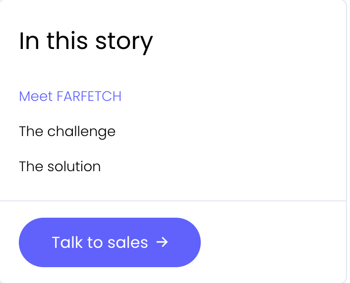
Content from the Monday.com x FARFETCH case study webpage.
Page content includes links to similar case studies, which keeps prospects engaged.
CTA design is consistent with monday.com's main branding style, and the CTAs are easy to spot.
Main takeaway: Use clear, zero friction CTAs to nudge your readers forward.
6. Optimise for SEO without killing the user experience
You want to ensure the page is discoverable without letting any SEO elements compromise readability. Your end user is a human, not a crawler, so make sure you’re including:
Keyword-rich headings.
Searchable filters (by industry, problem, size, etc.).
Unique, benefit-focused URLs.
Schema markup for reviews and testimonials.
In practice: Airtable x Vimeo
Why it works
Uses a short, clear, search-friendly, keyword-focused URL: i.e. /customers/vimeo
Includes relevant keywords naturally throughout the page.
Features compelling quotes and schema-friendly elements that Google loves.

Content from the Airtable x Vimeo case study webpage.
Maintains a simple, easy-to-read layout that doesn’t feel like SEO-first content.
Main takeaway: Searchable and human-friendly.
Your case study pages are ‘trust-builders’
Your case study page is a proof point. A conversation starter. A conversion tool. So don’t just ‘publish’ them and treat them like regular blog content; really think about aspects like how you’re telling the story, what the headlines are, whether you have enough compelling customer data to include, and what you want your target audience to do next.
Great B2B brands treat their customer stories like landing pages, not blog posts. And it’s no surprise that the ones doing it best are the ones consistently winning more business.
====
Now that you’ve read this, you may also be interested in:

