Creating better worlds with onboarding experiences
Photo by Kelly Sikkema on Unsplash
Exploring a new world can be a scary experience — that was certainly the case for Nathan in his digital afterlife…
In Amazon Prime’s new sci-fi comedy Upload, party boy Nathan uploads his consciousness to a digital paradise. When he wakes up in his luxurious virtual resort, he meets a customer service ‘angel’ Nora, who provides him with an overview of his new world as part of an onboarding experience.
However, when Nathan is left to explore his surroundings, he soon discovers that his new world is indeed a very different and confusing place. He needs a password to buy a cup of coffee; breakfast immediately disappears after 10 am; even his annoying hair lick won’t go away.
When Nathan is eventually driven to insanity, he attempts to abandon his so-called paradise by heading for a torrent, a digital stream that supposedly takes people back to the real world. Fortunately, Nora drops-in to intercept Nathan’s path to self-destruction and reassures him in a heart-to-heart talk.
Adapting to a new environment can be mentally challenging for anyone, which is why we need to carefully construct onboarding experiences, even for digital sims like Nathan.
The ‘guardian angels’ of digital worlds
Exploring a new world can be overwhelming which is why you need a ‘guardian angel’ like onboarding system
An onboarding experience is designed to help people like Nathan to familiarise themselves with their new surroundings. However, it’s always inevitable that you’ll become lost and confused as you delve deep into the wilderness.
Onboarding experiences are essential for familiarising people with their new world and giving them the reassurance they need
A ‘guardian angel’ like Nora, will appear at the right places at the right times to help settle you into a new environment as part of a continuous onboarding experience. Whatever form this customer service rep may take, it can acquaint you with unfamiliar surroundings and build up your confidence in taking more control. In time, these attributes will help strengthen your emotional connection with your world.
Onboarding experiences in real-world products
Onboarding experiences in products are designed to train your behaviour
Not only do fictional digital afterlives benefit from onboarding experiences — websites, apps, and games need them too! Like Nathan, people learn new features to make the product more memorable, which then increases the likelihood of successful adoption.
Onboarding experiences make the product more memorable, and by doing so increases the likelihood of successful adoption
New products, particularly those that offer unconventional features, require additional investment in time and effort to learn. Onboarding experiences, such as guided tours, tooltips, and demos, can help users learn about how their environment works. However, they are also essential for welcoming back visitors who haven’t engaged for a considerable amount of time.
For example, I recently updated Adobe Lightroom after months of neglect. when I upgraded and opened the photo editing software, I was surprised to find that the entire interface had changed. However, I was soon reassured by a simple, progressive onboarding experience which allowed me to digest information in small bite-size pieces.
Designing for an onboarding experience using behavioural economics
Combining psychology with economics to master onboarding experiences
Designing for an onboarding experience requires care and attention, which can be achieved by using behavioural economics — the study of the psychological effects on why individuals make certain decisions.
Progressively sage the investment you want from users into small chunks of work, starting with small, easy tasks and building up to harder tasks — Nir Eyal, Hooked
Here is a list of some behavioural economic theories which can help influence user behaviour to explore, learn, and develop their skills in using a product, as part of an onboarding experience.
Soft incentives
Giving users a reason to commit
An incentive is the promise of a future reward for an action taken today. Your onboarding process may need to describe emotional or community-based values to encourage user behaviour. For example, a fitness app may explain the personal benefits you can achieve from signing up.
Personalisation
Making the experience more relevant to the user’s needs
Machine learning can learn about what the user does and utilise the data to predict and change behaviour. When you signup to a Spotify or Apple Music account, the app asks for your preferences and then makes recommendations tailored to your tastes. Medium also takes a similar approach by asking new members the kind of topics they’re interested in.
As part of an onboarding experience, ask your users an appropriate amount of questions to help drive personalisation. In time, this will help make the product feel more relevant to the user’s needs.
Optimal information flow
Helping users to get through a flow
A process that is used once or infrequently, such as a signup or checkout, should contain an optimal information flow, which involves providing visitors with the appropriate ordering of steps and weight of information.
When designing for an onboarding experience, consider providing visitors with a clear understanding of their flow, as well as presenting information in small, simple steps. The amount of personal data you ask for should also be kept to a minimum — there can still be plenty of opportunities for learning more about your users later on.
Endowed progress
Motivate users with an illusion of a head start
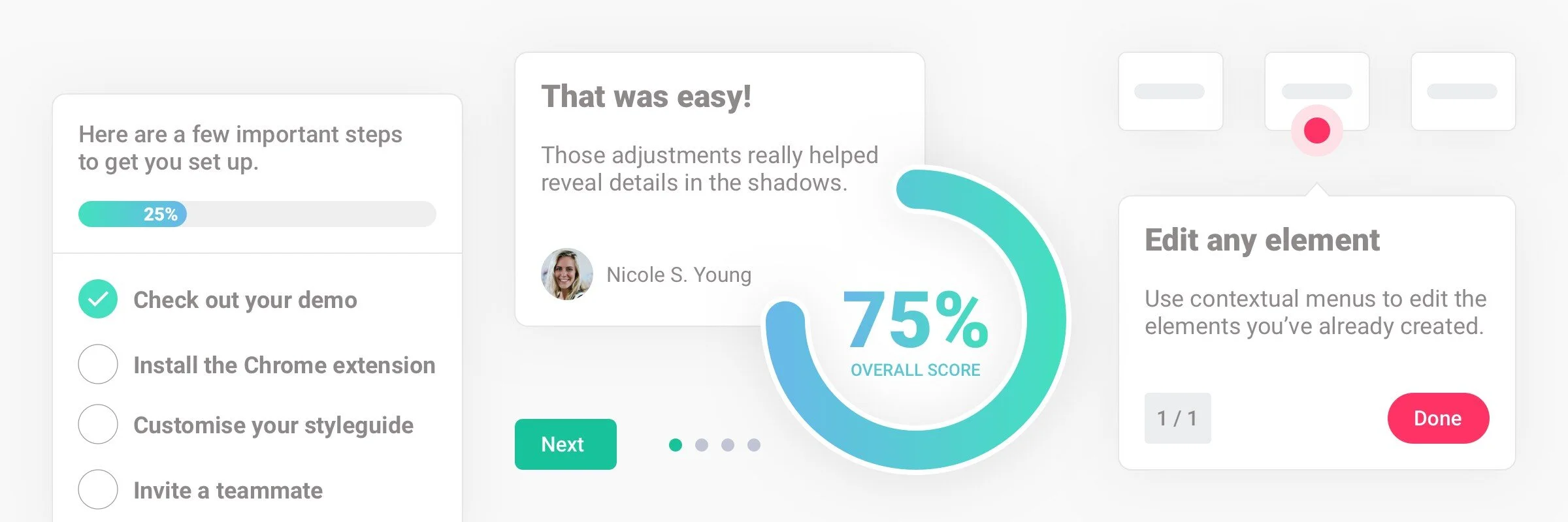
The endowed progress effect is about giving users the illusion of a head-start which can inspire them to increase their efforts to engage with onboarding activities. For example, Qordoba, an artificial intelligence writing assistance, motivates new learners by assigning them to an interactive demo, which contains completed tasks and an attractive high-performance score, by default.
The endowed progress effect essentially gives users a nudge, so to speak, however, to help increase efforts towards completing onboarding objectives, then consider goal-gradient strategies, including milestones and rewards.
Cues
Prompt users to perform an action
A cue, also known as a trigger, is a signal in the user’s internal or external environment that prompts them to act. For example, when your phone vibrates or pings, you check the device.
Cues are essential for creating a continuous onboarding experience, or for providing new updates throughout a journey. For example, InVision uses pulsating spotlights to indicate where new features exist and to stimulate engagement.
Reinforcement learning
Reward development and learning
Also known as reward learning, this design technique can help increase the frequency that someone performs a behaviour. By rewarding visitors with positive praise or tangible rewards, such as points and badges, for their development, can improve how often they’ll engage with the onboarding experience and the overall product.
For example, in the mobile game Lego Tower, players are rewarded with currency by completing objectives during an interactive tutorial.
A collection of onboarding designs inspired by behavioural economics
Cognitive load balancing
Make learning progressive
Present too much information to someone at once, and you’ll likely send them into mental overload and even risk diminishing product retention.
Cognitive load balancing helps limit how much mental work the user must do when learning how to use a product. Small fragments of information, progressively placed throughout a journey can help increase someone’s ability to properly perform tasks. For example, customer experience tool FlowMapp spotlights new areas of interest wherever appropriate, while Qordoba welcomes new visitors with a generalised, high-level guided tour without presenting too much information.
Choice architecture
Guide users to a particular desired choice
When presented with different options, people will likely perform the default behaviour. This isn’t out of laziness, it’s how our brains are wired to take shortcuts to make decisions easily.
Choice architecture can help guide users to a particular desired choice when faced with several possible actions. For example, a smart building design might make it more attractive and easier to take the stairs rather than opting to use an elevator.
To motivate users to engage with an onboarding process, such as a tutorial, consider simplifying the decisions, as well as making the benefits and level of commitment clear. Video games particularly apply efficient choice architecture by incentivising objectives with rewards, including points and achievements.
Optimal challenge
Find the right balance of difficulty to challenge learners
Finding the ‘sweet spot’ for the amount to push someone to perform an action requires finding the right balance of difficulty — an optimal challenge. Make a task too easy for someone, then they may not achieve their goal; however, make it too hard and you might induce fatigue and burnout.
For an onboarding experience that is aimed towards improving productivity, it’s essential to challenge learners with an appropriate level of difficulty. Increased learning can also be influenced by goal-setting, such as adding realistic to-do lists similar to LinkedIn.
=====
Exploring a new world — whether it’s an entirely new app or even a digital afterlife, can be a scary experience. However, reassurance and confidence can quickly be reinforced by some gentle hand-holding.
When designing for an onboarding experience, think of it as a customer service rep or a digital ‘guardian angel’; someone who is available at the right place and at the right time. Keep your new users interested and busy, but be careful to not make their challenges too difficult.
Onboarding is an essential foundation for building better and more meaningful worlds. So remember, when someone visits your product, look after them in the way that you would expect to be treated.
Takeaways
Onboarding experiences not only highlight key features — they’re essential for reassurance and confidence building
Encourage people to learn new behaviours through progressive challenges and by rewarding developing
Make the onboarding experience fun — first impressions will be everlasting
Special mentions
Boundless Mind — Digital Behavioural Design
Nir Eyal — Hooked: How to Build Habit-Forming Products
Kawaii icons (used in all illustrations) — Freepik
=====


